UI / UX Design
"NINE" CONNECTING WOMEN
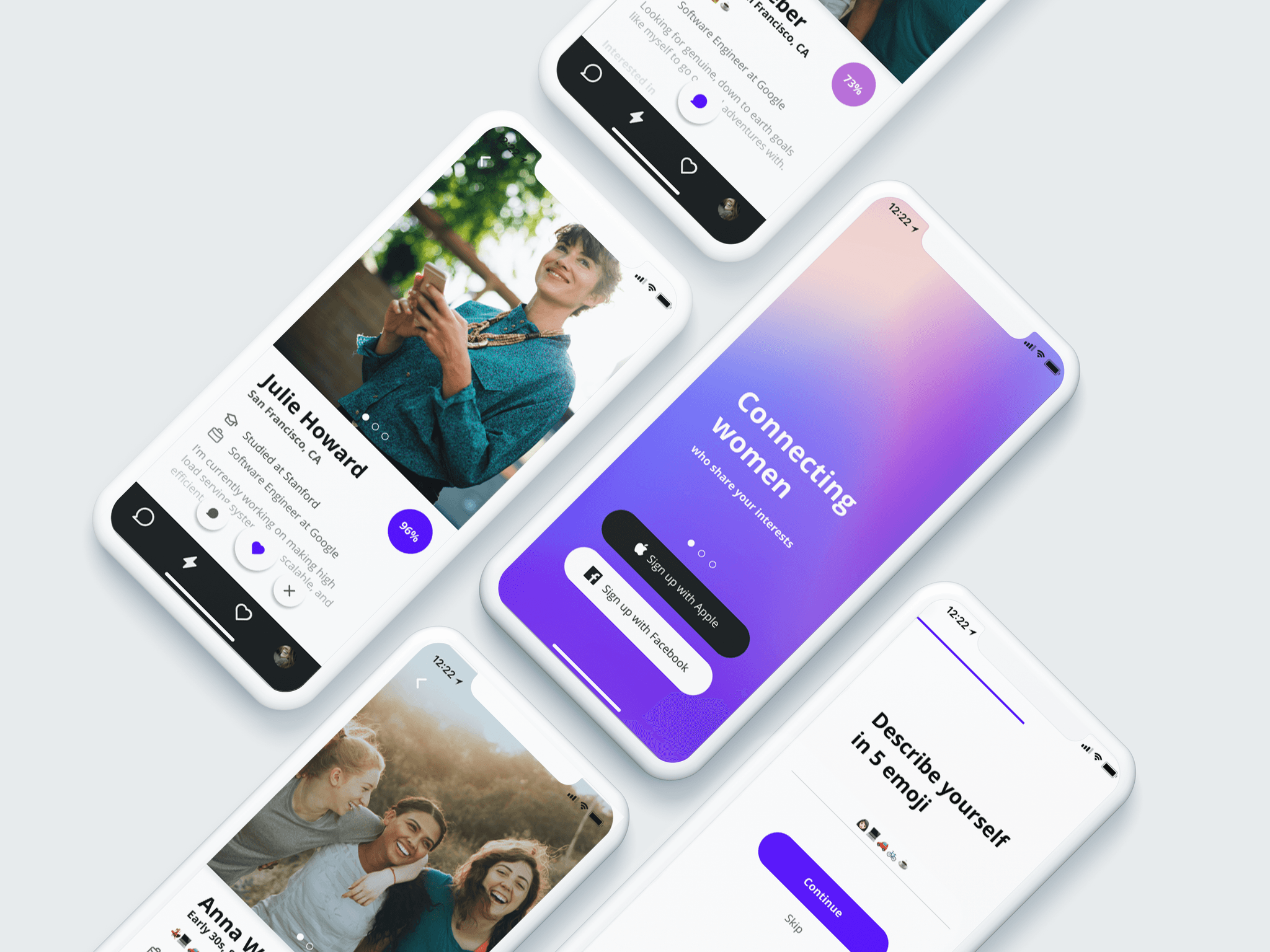
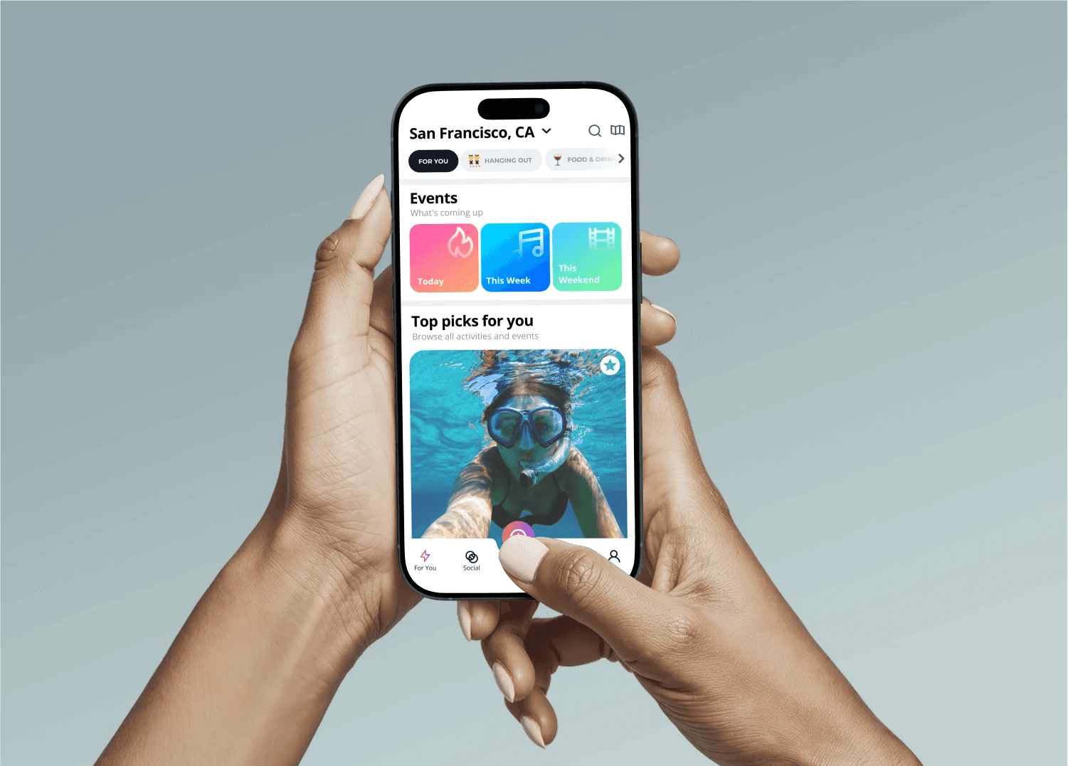
"NINE" is a social discovery app for women to build meaningful connections—wherever they are in the world or in life. Whether you’re traveling, moving to a new city, navigating a life transition, or expanding your professional network, NINE makes it easy to discover and connect with people who truly resonate.
Year :
2019
Industry :
Tech
Client :
Studio Nine
Project Duration :
10 weeks
MY ROLE:
I led the design journey for product team, partnering with Product Manager, and Development team.
RESPONSIBILITIES:
Research, competitor analysis, defining design trends, patterns, new capabilities, etc, Revenu models, business models.
Building products across native mobile, Design wireframes, flowcharts, visual mock-ups, and prototypes realized new features like inbox, messenger, group chats, Improved Onboarding, Improving Search, User testing.
Problem :
My goal for the project was to make easy and quality connections between women. Our team was looking for the best viable solution on how to create a new pattern that helps to find new, quality contacts based on the users’ interests and needs.
High-level goals were to:
Make quick and easy onboarding for everyone.
Choose the right fit for the user. (Find the right connections for the user)
Create a safe platform for deep and meaningful connections.
WIREFRAMING :
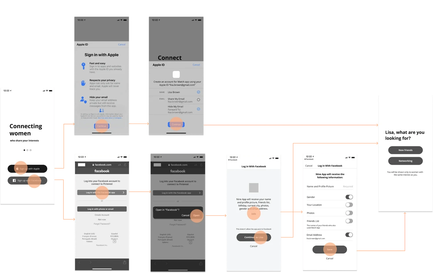
After defining the user flow, I created the paper low-fidelity prototype and later recreated it in Figma to get feedback, evaluate, and iterate.
At the Wireframing stage, I decided on the sections where the user will receive the result based on their task. I decided on the main screens and the sequence of the User Flow.
SIGN UP, ONBOARDING:
Users can create a new account or login via Facebook or Apple ID.
One of the pain points I discovered during the interview is that users want to be able to sign up quickly without having to enter their email and create new passwords. One of the existing patterns for such apps is signing up with Facebook and via phone number. I also discovered that some users don’t like to sign up with Facebook because they don’t want their Facebook friends to know what apps they are using. At the same time, they are also not willing to share their phone numbers because they consider it private information.
After discussing different options, I decided to give the users two options to sign up: using Apple ID and Facebook. It allows users to sign up quickly without typing an email or creating a new password. Apple ID is a relatively new sign-up pattern, and it respects user privacy, allowing users to hide or share their email but still receive messages from the app.
VIEWING PROFILE
The first result is a list of 9 profiles in the form of cards, which contains brief information about people and the percentage of compatibility with the interests of the user. By clicking on a person’s profile card, the user can easily scan all the basic information about a person.
Switching between modes: friends, professional
Depending on the needs at the moment, users can easily switch between the "friends" and "professional connections" modes.
User Testing
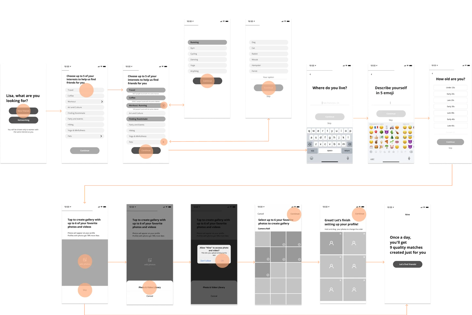
The main task of user testing was to validate ideas, analyze how users cope with the flow, what things are confusing, and what are simple to understand. Based on a testing of 10 users, I noticed that users can easily cope with registering and filling out the questionnaire, and setting and filling out a profile did not cause any problems. When testing, I found several points at which users didn’t understand what was happening and what actions should be done next; some nuances were not clear enough for a full-fledged experience.
Edits based on testing:
Friends Flow:
Added “Pets” in interests and added a selection screen where you can choose what pet you have.
Removed the issue of gender. Since we don’t match people based on their gender, we decided to give the opportunity to write in gender on user’s profile.
Pop-up — explanation of how buttons like ‘message,’ ‘decline profile’ work.
Added professional title to the card display so you can quickly scan basic information before checking the full profile.
In messages settings, added additional options ‘Unmatch’ and ‘We met.’
Decided to give users an option to quickly navigate between ‘Messages’ and ‘Profile’ to enable the user to view the matched profile.
Professional Connections Flow:
Added profession to card display.
Added Marketing and PR + Design as an option in ‘Professional Field.’
Removed option ‘exploring other companies’ since this function can be performed by networking or exploring new projects.

More Projects

UI / UX Design
"NINE" CONNECTING WOMEN
"NINE" is a social discovery app for women to build meaningful connections—wherever they are in the world or in life. Whether you’re traveling, moving to a new city, navigating a life transition, or expanding your professional network, NINE makes it easy to discover and connect with people who truly resonate.
Year :
2019
Industry :
Tech
Client :
Studio Nine
Project Duration :
10 weeks
MY ROLE:
I led the design journey for product team, partnering with Product Manager, and Development team.
RESPONSIBILITIES:
Research, competitor analysis, defining design trends, patterns, new capabilities, etc, Revenu models, business models.
Building products across native mobile, Design wireframes, flowcharts, visual mock-ups, and prototypes realized new features like inbox, messenger, group chats, Improved Onboarding, Improving Search, User testing.
Problem :
My goal for the project was to make easy and quality connections between women. Our team was looking for the best viable solution on how to create a new pattern that helps to find new, quality contacts based on the users’ interests and needs.
High-level goals were to:
Make quick and easy onboarding for everyone.
Choose the right fit for the user. (Find the right connections for the user)
Create a safe platform for deep and meaningful connections.
WIREFRAMING :
After defining the user flow, I created the paper low-fidelity prototype and later recreated it in Figma to get feedback, evaluate, and iterate.
At the Wireframing stage, I decided on the sections where the user will receive the result based on their task. I decided on the main screens and the sequence of the User Flow.
SIGN UP, ONBOARDING:
Users can create a new account or login via Facebook or Apple ID.
One of the pain points I discovered during the interview is that users want to be able to sign up quickly without having to enter their email and create new passwords. One of the existing patterns for such apps is signing up with Facebook and via phone number. I also discovered that some users don’t like to sign up with Facebook because they don’t want their Facebook friends to know what apps they are using. At the same time, they are also not willing to share their phone numbers because they consider it private information.
After discussing different options, I decided to give the users two options to sign up: using Apple ID and Facebook. It allows users to sign up quickly without typing an email or creating a new password. Apple ID is a relatively new sign-up pattern, and it respects user privacy, allowing users to hide or share their email but still receive messages from the app.
VIEWING PROFILE
The first result is a list of 9 profiles in the form of cards, which contains brief information about people and the percentage of compatibility with the interests of the user. By clicking on a person’s profile card, the user can easily scan all the basic information about a person.
Switching between modes: friends, professional
Depending on the needs at the moment, users can easily switch between the "friends" and "professional connections" modes.
User Testing
The main task of user testing was to validate ideas, analyze how users cope with the flow, what things are confusing, and what are simple to understand. Based on a testing of 10 users, I noticed that users can easily cope with registering and filling out the questionnaire, and setting and filling out a profile did not cause any problems. When testing, I found several points at which users didn’t understand what was happening and what actions should be done next; some nuances were not clear enough for a full-fledged experience.
Edits based on testing:
Friends Flow:
Added “Pets” in interests and added a selection screen where you can choose what pet you have.
Removed the issue of gender. Since we don’t match people based on their gender, we decided to give the opportunity to write in gender on user’s profile.
Pop-up — explanation of how buttons like ‘message,’ ‘decline profile’ work.
Added professional title to the card display so you can quickly scan basic information before checking the full profile.
In messages settings, added additional options ‘Unmatch’ and ‘We met.’
Decided to give users an option to quickly navigate between ‘Messages’ and ‘Profile’ to enable the user to view the matched profile.
Professional Connections Flow:
Added profession to card display.
Added Marketing and PR + Design as an option in ‘Professional Field.’
Removed option ‘exploring other companies’ since this function can be performed by networking or exploring new projects.